For a while I’ve been curious about the effects of stock splits on price. I’ve heard rumors that when a stock splits is a good time to buy. It makes heuristic sense: People’s excitement about a company gets reinvigorated and because it’s now less expensive they can actually buy a share or two, so demand goes up and therefore price goes up. That’s the thought at least, but is it true?
Let’s test it.
What we’re going to do is to go through every stock in the S&P500 and look through the daily data values of the stock. If there is a split on a given day, then we slice out that piece of the chart with 250 trading days before the split (about a year) to 250 trading days after the split. That gives us 501 trading days of data (about two years) with the split happening right in the middle day. Then we plot all of those on the same chart, scaling to show change in value from the day of the split. This will look pretty chaotic, so to see the average trend we will also plot a thick, white line that shows the average change in value.
Let’s dive right into the results here and put the programming details later because I realize not everyone LOVES code. This is the resulting chart:
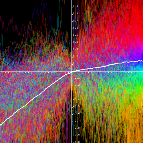
Tics on the x-axis represent 10 day increments; tics on the y are ten-percent changes. Percent changes are done relative to the smaller of the two values. That solves for the problem that if something is cut in half, it’s -50%, but if it then returns to it’s original value it is +100% when really they’re the same proportional change.
What are the colors? Hundreds of stock lines are plotted on this chart. A line representing a stock is colored based on how on the final observed day. If a stock is up 50% one year after the split, the whole line will be a deep red. Lesser gains progress through the rainbow. This effect was applied so that we could see if any patterns leading up to the split translated to gains afterwards.
Of course there is huge variance in price outcome over a year, so we’re also calculating the average to see the general trend. The white line is the average relative value compared to the price on the day of the split. What you’re seeing with this plotted trend is that, on average, a stock gains about 76% in the year leading up to the split, but then after the split, the slope immediately changes and gains average at about 14% in the year after the split.
How does this pattern compare to a regular chart? To see that, we randomly selected stock data windows (same size as the stock split windows) and plotted those in a similar manner. This is what you get:
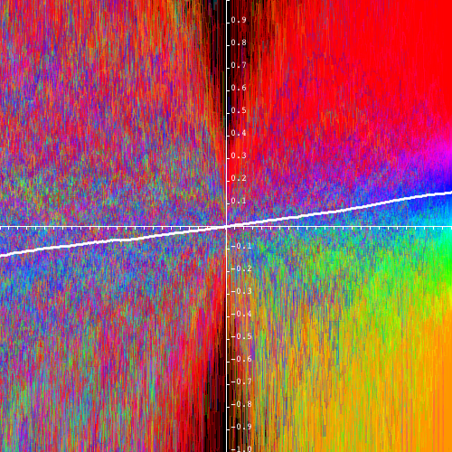
That average couldn’t get much more linear. Going into the reference day, there’s about a 14% gain, going away from the reference day it continues with the 14% gain. What’s notable here is that with the splits chart, the slope of the average gain closely matches the average slope of the randomly selected chart. A year after a split day or any given random day, both on average, are up 14%. The big takeaway: Stocks will have high gains leading up to a split, but once that split happens gains become normal compared to the market. After a split, the party is over.
Try this yourself
First step is to get the data. Get a Quandl API key (aka “auth token”). This increases your download speed limit from 50 per day to 2000 per 10 minutes. Get your API key by signing up here then visiting your user page and copying the auth token. Quandl has a lot of free data, but for this experiment you’re going to need split data, which you can get here.
Fork it. The full code for this project is available on GitHub. It’s in Java. You might find this code useful beyond this experiment as it contains classes to do bulk downloads of stock data. Once you have the code, execute the DownloadStockData class and it will automatically get the S&P500 stock constituents list and then download the data for each of the stocks. Then execute the EffectsOfSplitOnPrice class to produce the charts.
If you have any thoughts, let’s talk on Twitter where I’m @BrianRisk